Excel 2013 Graph comparing "面 Section graph" 3D display will also be used
Although it looks similar to a broken line graph, the surface graph is completely different.This time, we will introduce how to make full use of the surface graph!
■ Use the surface graph with transparent processing and 3D display
The surface graph is a style that is suitable for comparing graphs.It looks like the lower side of the folded line graph is colored, and is generally suitable for comparing a small number of graphs, such as comparing two graphs.However, in Excel 2013, the functions are substantial, such as the transparency display of the graph, the order of the order, and the 3D style, so it is possible to compare multiple graphs.If you know the characteristics of the surface graph and compare multiple graphs, let's introduce a useful function.
■ Graphs that are good at comparison of graphs
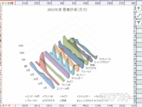
↑ ↑ The graph behind is peeking from the gap between the graph placed on the front, making it easy to compare.
It is also characterized by the fact that 3D can be used effectively.Verical when the number of graphs to be compared.
■ "Mimics" for utilizing surface graphs to eliminate overlapping overlapping
When creating a surface graph, the problem is "overlapping".When a small graph of the numerical values goes around the large graph of the numerical value, it becomes completely invisible.In such a case, by changing the display hierarchy or transmitting the graph, the graph hidden on the back can be grasped properly.
Step1 Change to the front of the hidden graph behind
↑ Call the "Select Data Source" window with "Select Data".
↑ Select the data in ↑ "例 例 例 例 例" "" "" "" "" "" "" "
↑ Move to the top of the graph.Change the display order of the graphs that are small and hidden behind.
STEP2 The graph hidden on the back is displayed by transparent processing
↑ Select “Data series format setting” from the right -click menu of the graph to display the setting item on the right end of the window.
↑ Select the “Effect” icon in “Data series format setting”.Select "Painted (single color)" in the "painted" item.
↑ If you select your favorite color in the color "item, enter the numerical value in the" transparency "item.The graph is transmitted, and the back graph can be seen through.
↑ Repeat the same procedure, and other graphs are also set transparent processing in order.You can check the graph hidden in the graph on the front.
STEP03 Change the length of the display angle and depth in 3D style
↑ Select "3-D surface when creating a graph.The depth is set in the plot area, and the graph of your own becomes three -dimensional.
↑ ↑ "" "" "" "" "" "" "" "" "" "" "" "" "" "" "" "" "The plot area extends to the back.
↑ Adjust the angle to be displayed in the X direction and the rotating item in the Y direction.The angle is freely changed to a position that is easy to grasp the graph.
↑ Furthermore, it is possible to combine the transparent display of the graph.You can also grasp the parts that were hidden behind the scenes and did not see them.
■ Actively use 3D if displayed at the same time
Although it is a surface graph suitable for the comparison of the graph, it is difficult to recognize even if there is a large number of transparency.In such a case, use the 3D display.In the default state, the data label is displayed between the top and the horizontal axis.It is better to check with the data label.
↑ If you adjust the angle and depth, you can cover up to about 30 people if you adjust the angle and depth.
↑ In the surface graph, it is ◎ to combine the data table and the descent line.Check the numbers in the data table.
As mentioned above, I have seen about how to make a surface graph in Excel.Please use it for practice.
"Excel Dojo -Secret Society Extension" is being popularly serialized in the Weekly ASCII magazine.Please check it out and enjoy Midori's great struggle!
