The problem that the order of items is reversed in Excel table and horizontal bar chart, solution
This is a problem that has been around for a long time, so I think many people know about it, but I think there are people who are in trouble now, so I would like to write about it. I will send you a lot of images to show you the procedure to solve it if you do it exactly like this.
■This is the problem in the first place.
Suppose you have a table like this:
to create a horizontal bar chart for this table...
As shown in the figure, the part of the table that says “Editor, Muralin…” and the item names on the left side of the graph By the way, the order from the top is reversed. I can imagine why this is the case (because the top left of the table is the base point, and the bottom left of the graph is the base point), so there may be cases where it doesn't matter as it is. However, there are many cases where you want the graphs to be arranged in the same order as the table. In my case there are many. So, how can I do it in the same order as the table ... Excel's (graph) settings are really difficult to understand. I wonder if Excel's UI designer was the type of pervert who would be happy to see other people in trouble. And here's how to do it.

■ Procedure to make the order of items the same
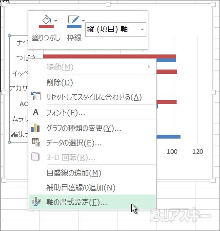
| ↑above the letter of the item on the left of the graph Move the mouse cursor to , confirm that "vertical (item) axis" is displayed, and press the right click. If the cursor is between characters, it may not appear. |
| ↑Click "Format Axis" at the bottom of the menu. |
| ↑Starting with Excel 2013, another window called "Axis Formatting" will be displayed on the right side of the window as shown in the figure. I was. |
This “Format Axis” window is available in the “ You can also open it from "Graph Tools" (However, it is quite difficult to understand if you are not used to it, so I won't explain it this time. Once you get used to it, it will be convenient as it is. You can also open it by touch operation).
| ↑ Until Excel 2010, a dialog like this・The window was open. Since the items to be set are the same, the screen of Excel 2013 will be explained below. |
| Check "Invert Axis" near the bottom of the "Axis Options" heading. Then……. |
| ↑Wow, the order of the items is now the same as the table. That's fine, but the numbers 0, 20, 40, etc. that were on the bottom went up. That's what "reversing the axis" means. |
■ Display settings that became strange due to axis reversal
So, this time, set the numbers 0, 20, 40, etc. that went up to the bottom.
| ↑Numbers like 0, 20, 40... Place the cursor there and confirm that "horizontal (value) axis" is displayed, then click (note: do not right-click). |
| ↑The display in the right window has changed. |
| ↑This time, you should set here. Change the "Label Position" at the bottom of the window to "Top/Right". |
Numbers (characters) of 0, 20, 40 ... are "labels" That's what you call it. We want to bring the label to the bottom like the first time, so we want to select the "bottom edge", but now we are in the "reversed vertical axis" state, so we select the opposite "top edge". What is the "right end" written together? That's why it's not difficult to understand.
| ↑, it became like this. This is complete, but I'd like to tweak it one more time. |
| ↑ Click on the blank area between the bars of the graph → Paint can icon → “Border” → “Line ( Single Color)”. In the "color" below, choose a slightly lighter gray. |
| ↑Then the graph is surrounded by a key line. The color of the key line is light gray, so it's a subtle difference, and it may be a matter of taste, but I feel that this one looks more like a graph. |
Actually, in Excel 2010 and earlier, there is a key line at the bottom from the beginning, and “ When you "flip the axis", the lower key line goes up along with the "label". And this key line does not return to the bottom even if the axis label is set to "Top/Right". So, if you are using Excel 2010 or earlier, I think you should remember to enclose the entire graph.
| ↑Excel 2010 chart. There is a horizontal line at the bottom of the graph, and it has gone up due to "axis inversion". Let's enclose the whole graph because we can't put it back down. |
This time, I flipped the vertical axis, but of course, there is also a setting item to "invert the axis" on the horizontal axis, and if you check it, the graph will look like the following.
I can't really think of a way to use it, but in combination with whether it's inverted or not, it's a population distribution graph by age. You may be able to use it when you make it.
| ↑This is it. |
Have a nice horizontal bar chart life. Thank you for your attention.


