Teaching the correct usage of "line graph" that can examine Excel 2013 data from various angles
When comparing multiple graphs, a line graph is often used. This time, I will introduce a convenient way to use the line graph!
■ Line graph that is useful not only for comparison but also for analysis
Line charts are a style often found in meeting materials and are used as often as bar charts. This is especially useful when you want to compare multiple graphs because the graphs are displayed on top of each other. On the other hand, it is also suitable for analyzing trends in graphs and the flow of numerical values. In addition, auxiliary graphs such as "average transition" and "linear prediction" can be used, and it is attractive to be able to examine data from various angles based on the numerical values of the created graph. If you master the line graph, you will be able to find out the truth hidden behind the numbers.
■ How to use the line graph
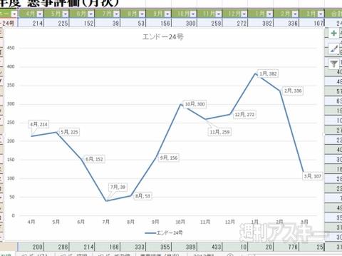
↑ Line graphs are perfect for expressing the passage of time and changes in numerical values. You can understand the “flow”.
↑ Displaying a marker makes it easier to recognize the graph and makes it easier to grasp the passage of time.
■ Grasp the numerical value with the auxiliary graph
Step1 Analyze the data in detail with the auxiliary graph

↑ Select "Design" in "Graph Tools" and click "Add Graph Element". Select "Average transition" in "Approximate curve".
↑ "Transition of average" is a graph that plots the average by calculating the average from the numerical values in a certain section. Get a clearer picture of patterns and trends.
Step2 Predict future trends with "Linear Prediction" graph
↑ Select "Linear Prediction" in "Approximate Curve" of "Add Graph Element". If you have multiple graphs, choose the base graph.
↑ In the "Add Approximate Curve" window, select the member for whom you want to create a linear prediction graph, and an auxiliary graph will be displayed.
↑ The tendency is calculated from the numerical data of the selected member, and the subgraph is displayed as a straight line. You can know the future numerical forecast.
↑ Auxiliary graphs are created for each member. Each linear prediction graph is displayed, and it is also possible to compare auxiliary graphs.
Step03 Make it easier to distinguish graphs with markers
↑ Select the graph and right-click. Select "Format Data Series" from the menu. Formatting is displayed on the right side.
↑ From the three icons just below the heading, select the leftmost icon "Fill and Line".
↑ The "Fill and Stroke" settings are displayed. Select "Marker" in the item just below the icon and select "Marker Options".
↑ Select "Built-in" in "Marker options", and then set the shape and size of the marker in "Type".
■ The number of graphs displayed as a line graph is about 10.
In the case of a line graph, there is no problem with the display itself even if a relatively large number of cases are displayed, but if you want to grasp the numerical values etc. firmly, the limit is about 10 cases. On the other hand, the horizontal axis can expand a considerable number of items. Also, even if the number of graphs is large, it will be easier to compare by using "descent lines".
↑ Displays a graph for about 30 people. It is difficult to grasp a specific graph.
↑ Uncheck "Graph Filter" to reduce the number of people to display and display only 10 people. You can now recognize each graph.
So far, we have seen "How to make a 100% stacked graph" in Excel. Please use it for your practice.
"Excel Dojo-Secret Society Upstart Edition" is being serialized in Weekly ASCII magazine. Please check it out and enjoy Midori-san's great struggle!


