How to change only one scale line format?
You may feel that you want to change only one scale line format, such as when you show a target value on a graph. Unfortunately, Excel's chart tools don't support these formats. To change only one scale line format, it is necessary to utilize "figure" and "composite graph". This time, I will explain the detailed procedure.
About the format specification of the scale line
First, let's "review" the format specification of the scale line. This time, we will use the bar graph shown below as an example.
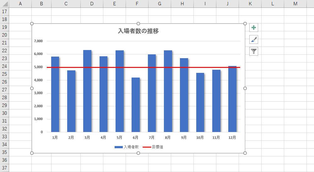
This graph summarizes the number of visitors to a facility, and the target number is set to 5,000 every month. To make this clear, let's consider changing only the "5,000 scale lines" to red.
First, try changing the format using the general procedure. Right-click on "5,000 Tick Lines" and use the "Border" command to change the "Color" and "Thickness" formats.
Then, as shown in the figure below, the format of all scale lines is changed.
The reason for this result is that the specifications do not allow each scale line to be handled individually. In other words, it is possible to "change the format of all scale lines", but it is impossible to "change the format of only one line".
Therefore, "changing the format of only one scale line" cannot be realized by the usual method.
Drawing scale lines using the "Shape" command
So how can you change the format of only one scale line? The first method I can think of is to draw the scale lines yourself using the "Line" command of the "Shape" command.
When drawing a figure in the graph, it is advisable to start drawing the figure with the graph selected. Then, "figure" and "graph" will be linked, and when the position of the graph is moved, the figure will be moved together (see the previous series for details).
In the case of this example
You can proceed with the operation.
Then, drag the mouse to draw a "line". At this time, you can draw a horizontal line by dragging the mouse while holding down the "Shift" key.
After drawing the "Line" at the approximate position, select the "Format" tab of the drawing tool and specify the line format with the "Shape Border" command.
After that, the screen display is enlarged and arranged so that the "line" just overlaps the scale line. To adjust the length of the "line", hold down the "Shift" key and drag the handle to change the length while keeping the line horizontal.

By proceeding in this way, it is possible (apparently) to change only one scale line format.
Although it is a bit of a brute force technique, there are surprisingly many cases where such a direct method is useful. Of course, it can be used not only for changing the format of scale lines, but also for changing the format of other elements. For example, it is possible to draw "Shape"-> "Text Box" and apply it to customization such as "Make only 5,000 labels red".
Drawing a scale line using an approximate curve
Next, let's introduce how to show the scale line as a "line" using a composite graph of "bar graph" + "line graph".
First, add the data to be displayed as a "line". In this example, we want to display the "line" in a straight line at the position of 5,000, so prepare a series of 5,000 for all data.
After preparing the data table, create a graph of "set vertical bar". Then right-click on any of the data series and select "Change Series Graph Type".
"Change the type of series graph" is displayed. Change the series of "Target value" added earlier to "Line" and click the "OK" button.
By proceeding with the work in this way, it is possible to draw a horizontal straight "line" at 5,000 positions. However, since this straight line is processed as a "line graph" to the last, there will be some gaps at both ends.
To extend this to the edge of the graph without any gaps, use the "approximate curve". Right-click "Line" and select "Add Approximate Curve".
The approximate curve setting screen is displayed. Select "Linear approximation" and enter appropriate characters in "Approximate curve name" (characters to be displayed in the legend). Then, specify 0.5 for "anterior extrapolation" and "posterior extrapolation".
If specified as above, a straight line (approximate curve) extending to the end of the graph can be drawn. By the way, "anterior extrapolation" and "posterior extrapolation" are setting items for extending the approximate curve back and forth. If "0.5" is specified here, it is possible to extend the approximate curve (straight line) to the left and right by half an item.
Next, let's change the format of the approximate curve drawn by the "dotted line". Right-click the trendline (dotted line) and use the "Border" command to specify the line color, thickness, and type.
By proceeding in this way, it is possible to realize scale lines with different formats only at 5,000 positions (apparently).
If you look closely at this graph, you can see that three items are displayed in the legend. Specifically, three "bar graph series", "line graph series", and "approximate curve" are displayed in the legend.
Of these, the "line graph series" is the data used to draw the "approximate curve", so it is not necessary to leave it in the legend. It's confusing, so let's delete it.
You can select only one item in the legend by clicking on the legend to select it and then re-clicking on the "Line Chart Series" legend. If you press the "Delete" key in this state, you can delete the item from the legend.
This completes the work of changing only one scale line format. Finally, adjust the formatting of each element to make the graph look better. In this example,
-Enter the graph title-Change the thickness of the bar graph-Add a shadow to the bar graph-Change the character format of each element
I made customizations such as.
In this way, there is also a method of changing only one scale line format by utilizing the "composite graph" and "approximate curve". If you prepare two series shown by "polygonal lines" (approximate curves), you can change the format of the two scale lines.
It's a bit of a hassle, but it's useful to remember as a technique for drawing "horizontal lines" in any position and in any format you like.

![[Latest in 2022] Explanation of how to register DAZN for docomo with images | 31 days 0 yen free trial reception until April 17](https://website-google-hk.oss-cn-hongkong.aliyuncs.com/drawing/article_results_9/2022/3/28/22149d541c51442b38a818ab134a8cf0_0.jpeg)
!["Amaho no Sakuna Hime" celebrates its first anniversary. The Ministry of Agriculture, Forestry and Fisheries moved to allow you to experience rice farming in a depth unparalleled in the history of games.A rice farming action RPG with over 1 million units shipped worldwide [What day is it today? ]](https://website-google-hk.oss-cn-hongkong.aliyuncs.com/drawing/article_results_9/2022/3/28/378f9ee978fe8784d8ab439d041eee85_0.jpeg)


